Maynooth Furniture


Project Vision
Maynooth Furniture is a new business selling affordable
high-end design furniture. Maynooth aims to provide a platform where users can browse the catalog, place orders, and see the products in different environments and styles.
Challenges
1) Eliminate barrier to entry on application startup
2) Design a cohesive interface for familiar and unfamiliar users
3) Create a minimalistic UI while keeping products as the focus
4) Provide a seamless & linear purchasing experience
Objectives
we opted for a goal-directed design approach that helped us move along through the timeline smoothly. Qualitative research methods proved to be the most effective during our design process, most notably our user interviews and usability testing sessions. Whenever we encounter an issue that we are trying to solve, it's smart to build a good foundation. In Maynooth's case, we did this by asking some generic but useful internal questions.
"What is the product and who is it for?"
"What do our primary users need most?"
"Which users are the most important to the business?"
"What challenges could we face moving forward?"
"Who do we see as our biggest competitors?"
"What literature should we review to familiarize ourselves?"
Meet the Users

Name: Sara
Age: 32
Occupation: Nurse
Location: Dallas, TX
Sara is a married woman who has recently moved to a small apartment in downtown Dallas. She would like to purchase few furniture items for her new place. Sara is function-oriented and always try to keep her home as organized as possible. She is picky about color and style and would research for new looks before she makes any purchase.

Name: Katherine
Age: 50
Occupation: Executive
Location: Dublin, Ireland
Katherine is an executive at the local offices of a international medical device company. She earns a salary of $110,000 per year. She has children at University. She’s both style & price conscious. Katherine is updating the furniture at the 4 bedroom family home. The update in furniture is following the slow remodeling of the house now that her kids have left for university. She loves to browse style guides online. She uses Pinterest to gather her design ideas.
Competitive Analysis
To gain inspiration for our Furniture website and App, I took a closer look at Maynooth’s competitors and how they’re helping their users shop for furniture. Through my market research, I identified some top competitors within the industry: Wayfair, Ikea, Houzz, Amazon, Target, and West elm. I chose three of furniture-focused retailers and competitors similar to Maynooth. Exploring each of their apps and websites, I evaluated the strengths and weaknesses of each to see how our design could fill in any gaps moving forward.

Creating a Framework
To better understand how we would construct the core experience for Maynooth, we designed a user flow. This helped us focus more on the experience and needs of the user and less so on the details that we would solidify later on. It also allowed us to communicate the entries and exits more clearly so we would have a better understanding moving forward.


Wireflow/ Mid Fidelity Prototype
After sketching out some p&p wireframes and thinking through the preliminary flow, I reviewed what was necessary, unnecessary , and what areas needed improvement.
I poured a lot of our time into this step to make sure I had the finishing touches on the underlying UX before moving onto the visuals. To create my prototype, I first started by creating mid-fidelity wireframes on XD of the key screens the users would be interacting with.


Usability Testing
After creating our prototype from low fidelity wireframes, I prepared a 11 question survey for participants to fill out before I began conducting a usability test. We asked 3 different participants to run through different scenarios in our prototype in hopes of garnering enough feedback to use for our next set of design iterations.
-
3/3 users believed the quality, texture and tone of the fabric can change the look and feel of the sofa and the entire room. They wanted to see the true color and fabric weave.
-
2/3 users wanted to make purchases when they know the product is on sale and they will getting a deal.
-
2/3 users didn’t feel confident when trying to find the right category to browse in the “Shop by Department” section.
-
3/3 users said they would narrow options down more if they could (2/3 users tried to utilize the sub-categories on the product listing screen)
-
2/3 users wanted to know the exact combination of selectable features for the products shown.
CHALLENGE 1
Notifications
Users want to get a deal notifications on their favorites furniture. They would like to know when the furniture they want is on sale.
Maynooth users can get price change/sale notifications of their selected product by submitting their email addresses.

CHALLENGE 2
Seamless Exploration
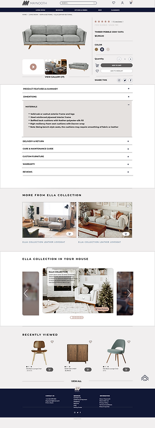
Users want to see the true color and fabric weave. Many websites showed color and fabric options, but not to a sufficient level of detail to make customers feel confident buying. Thumbnail images were often small and blurry, making it difficult to get a true idea of what the fabric will look like and feel like. Zoom functionality was hit and miss: some sites did a good job of letting you zoom in to see details of the stitching and fabric, while many other sites’ capabilities were not that robust.
Maynooth's material information included large high-resolution images. Each swatch came with a description of weave and texture.
Most Importantly Maynooth offers free swatches that user can order before placing their furniture order.

CHALLENGE 3
Eliminating Barriers in App
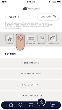
A key factor when trying to gain a userbase is to create a splash screen void of conflict. If the user wishes to browse the items within the app before creating an account, they might be more inclined to create one later on. Along with the login and register options, the "continue as guest" option allows for that users to browse the app without an account.

Style Guide


Prototype

High-Fidelity UI