


Project Vision
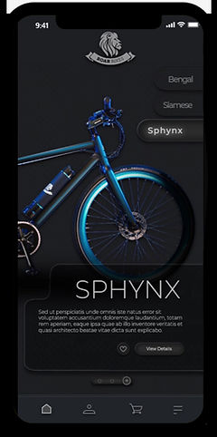
CG Cycles is a manufacturer of small run, contemporary bicycles sold exclusively from their website. CG Cycles currently have 3 models of bike to purchase (Siamese, Sphynx, Bengal).For this project, I decided to use a goal-directed design method which revolves around focusing on my persona creation and goals. The MVP for this product was developed as a mobile based application rather than being web-based to showcase my mobile design skillset.
Challenges
1) Eliminate barrier to entry on application startup
2) Design a cohesive interface for familiar and unfamiliar users
3) Create a minimalistic UI while keeping products as the focus
4) Provide a seamless & linear purchasing experience
Objectives
In this project, I took a goal-directed design approach that proved to be quite effective in my design efforts. I found qualitative research methods to be the most useful, consisting of literature review, competitive analysis, stakeholder interviews, and most important my persona hypothesis construction. I started out by asking myself some initial key questions.
"What is the product and who is it for?"
"What do primary users need most?"
"Which users are the most important to the business?"
"What challenges could we face moving forward?"
"Who are the biggest competitors?"
"What literature should I review to familiarize myself?"
I found data from my subject matter expert interview to be the most effective understandings I garnered. I then used an affinity diagram to separate the data into groups of tasks which were further categorized by high level goals for improvement in efficiency, process, depth, and familiarity. Recognizing the conflicts of interest from each audience allowed me to focus on shaping user goals and how those goals would in-turn also affect the business' goals.
Meet the Users

Name: Leyla
Age: 33
Occupation: Software Developer
Location: Ohio,USA
Leyla is a 33 year old software developer, from Dallas/TX who cares about environment. She relocated to Cleveland, Ohio few months ago for a great employment opportunity. She's take advantage of every ounce of warm weather Cleveland has to offer, by biking and just being outside. She would like to buy a new bike which is not only unique in its design but also versatile, durable, and able to handle difficult terrains. Leyla has had different bikes from major brands over the past 6 years and now she is looking for a step forward bike with an outstanding look.

Name: Jake
Age: 28
Occupation: Graphic Designer
Location: California,USA
Jake is a graphic designer for a large design agency in Los Angles. Jake prides himself on having strange & interesting versions of everyone elses everyday objects. His shoes are hand made & his backpack is pink. He likes to make his purchase (big or small) from local responsible crafts people. He doesn’t own a car. He always brings a reusable cup to the coee shop. Jake cycles to work and wants his bicycle to be practical but unique.
Competitive Analysis
To gain inspiration for my e-commerce website, I began by identifying 3 main competitors: Swifty Scooters, Yeti Cycles, and Santacruz Bicycles.
The most important takeaway from this activity was learning how different websites organized their bikes selection and the overall layouts they used for those websites. This was helpful information that helped solidify the stage for my second phase of research.
Findings from competitive analysis, combined with earlier research, revealed topics that needed further exploration.

Preparing the Journey
I constructed a user flow of what a basic start to finish journey looks like while purchasing an item. This helps me in understanding ways users can interact with the product, as well as allowing me to see navigation through user goals.

Wireflow
After sketching out some p&p wireframes and thinking through the preliminary flow, I reviewed what was necessary, unnecessary , and what areas needed improvement.
I poured a lot of my time into this step to make sure I had the finishing touches on the underlying UX before moving onto the visuals.


Usability Testing
After creating the prototype from low fidelity wireframes, I prepared a 16 question survey for participants to fill out before I began conducting a usability test. I asked 4 different participants to run through different scenarios in the prototype in hopes of garnering enough feedback to use for my next set of design iterations.
-
To choose a bike and successfully completing the checkout process.
-
To look for owner photos and their different stories with their bikes.
Along with this, unmoderated testing was carried out using Userteting.com. This helped me delve deeper into developing a website that was addressing users’ needs.
I drafted some key findings, which were derived using two testing techniques:
-
Most of the users were quickly able to navigate the website and locate products and information.
CHALLENGE 1
Eliminating Barriers
A key factor when trying to gain a userbase is to create a splash screen void of conflict. If the user wishes to browse the items within the app before creating an account, they might be more inclined to create one later on. Along with the login and register options, the "continue as guest" option allows for that users to browse the app without an account.

CHALLENGE 2
A Familiar Experience
While CG's primary audience is intended to be Bicycle enthusiasts, those outside of the bike arena need to be able to use the app as well. With recognizable iconography, intuitive gestures, and a linear purchase process, I feel that CG Cycles has achieved just that.
CHALLENGE 3
Quick, Simple, & Secure
With payment method and shipping specifics being accessible within a single screen, it doesn't allow for the user to second guess their purchase after the review screen. This design allows for minimal screen usage and a quicker checkout.

Style Guide

